Most TCG’s feature simple card frames that are almost unnoticeable, and ultimately, forgettable. We wanted to craft card frames that would establish our world from the moment you open your first pack of cards, and combine with the work of our freelance artists to create something truly memorable.
We knew very early on that we wanted each card frame to be unique. Each region and each hero class would have a different card frame, one that immediately establishes where that card belongs within the world of Rathe.
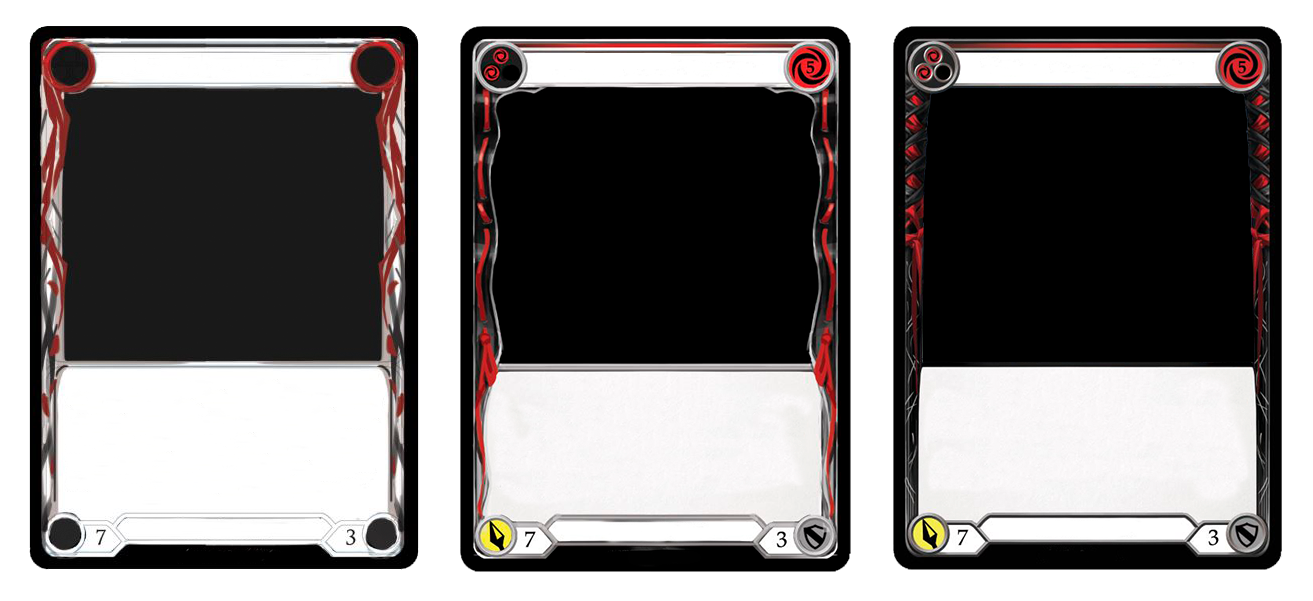
At first, our card frames started out fairly simple. We wanted to ensure that the art was the main focus, but this meant that our card frames were very thin, so every millimeter counted. This made it incredibly difficult to establish anything about the region or class associated with the card.
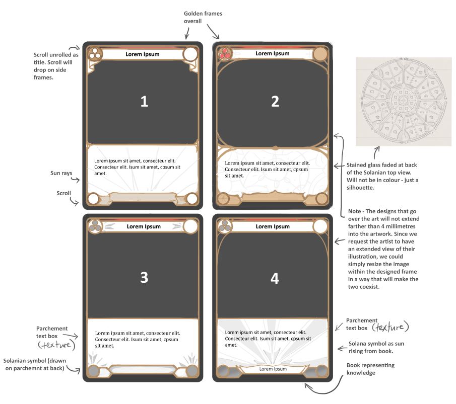
Solana became the first experiment. We widened the frame slightly to develop a filigree, pattern-based style, but while this worked well for Solana, it didn’t prove as effective for other regions. So, the cards slowly became more and more intricate, allowing more room for the personality of each region to shine through.
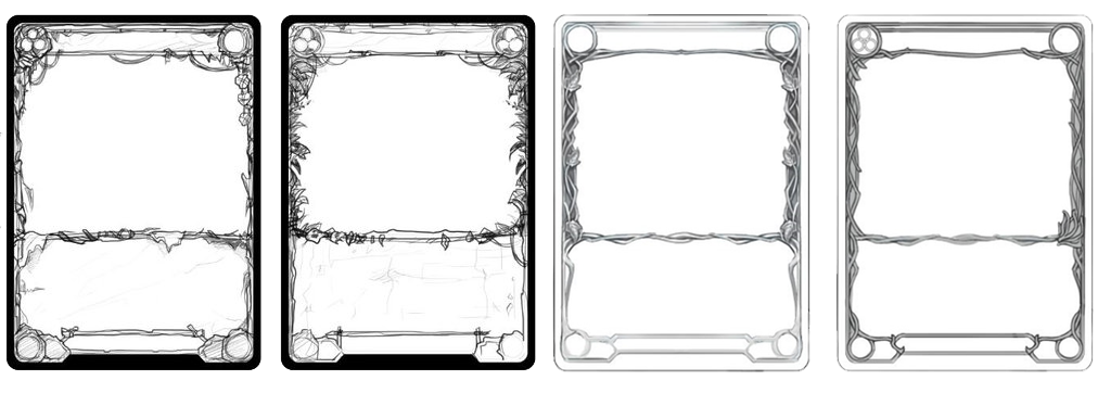
Once we broke away from the idea of thinner frames, we were able to have more freedom in designing each card type, since there was more space to work with. The boxes and card frames, ultimately, aren’t much bigger than when we started – but we became more creative with how we used that space.
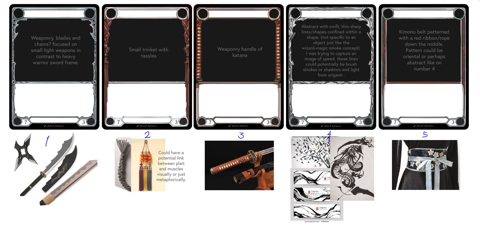
It also gave us more flexibility for class frames. While we began with a few different ideas, we soon honed in on frames based around weaponry. For example, we originally started with several different ideas for the ninja frame, but ultimately decided on giving it the appearance of a katana handle. Meanwhile, the other classes in Welcome to Rathe are based on a club, a sword, or a hammer, respectively.
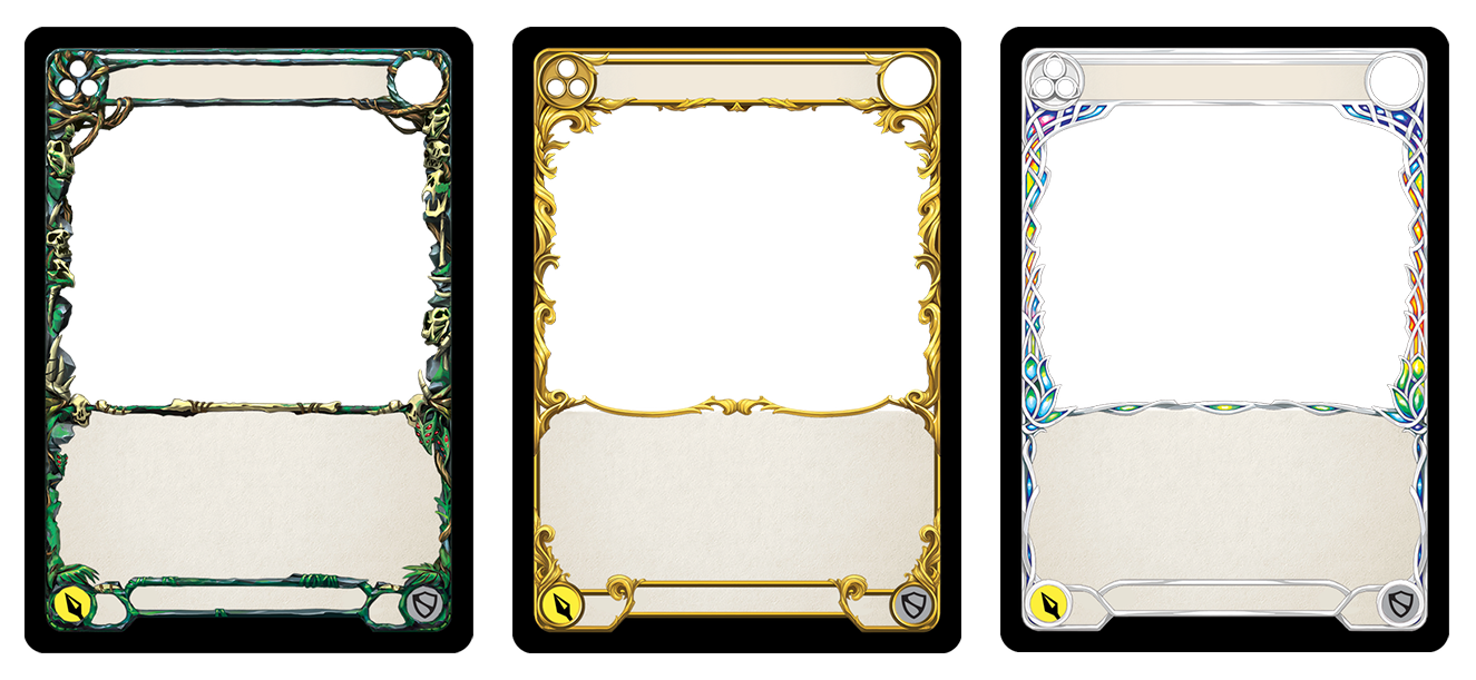
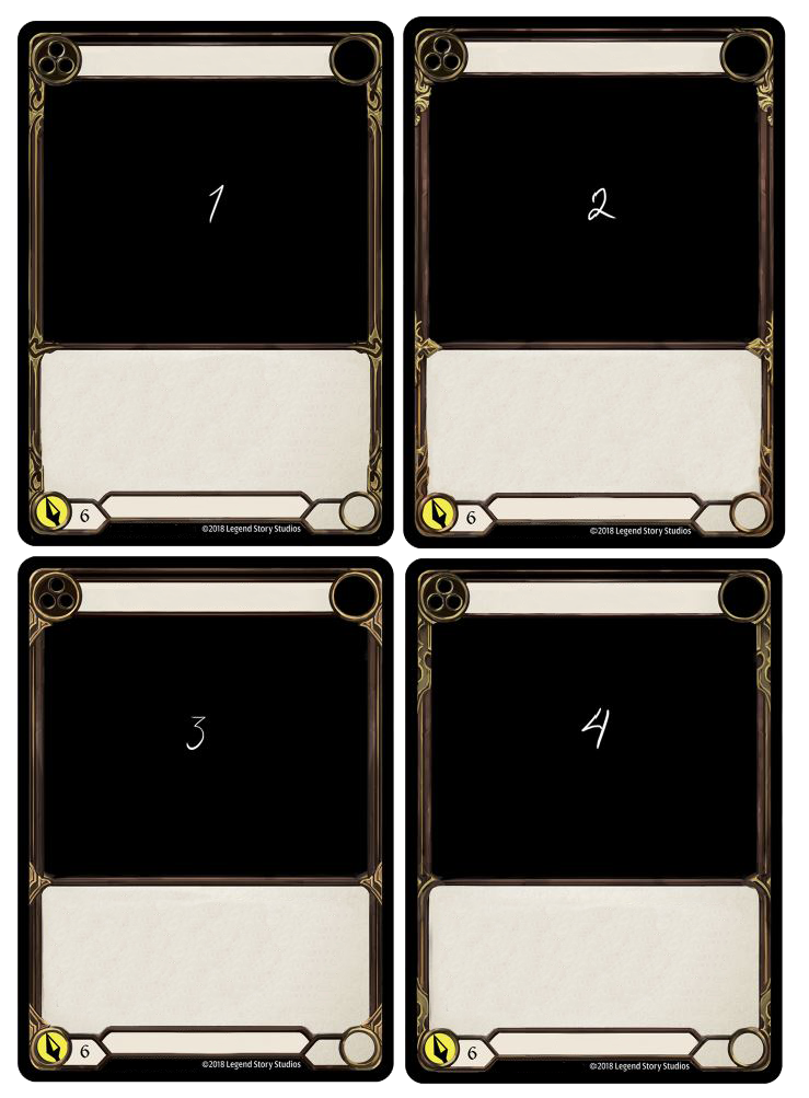
For the generic card frame, we decided to go back to basics. While other TCG’s might treat generics as boring and less important, in Flesh and Blood, generics are our building blocks, the cornerstones that help to create the game as a whole. Where our other frames work to depict certain regions or classes, it is the generic class frame that communicates the identity of Flesh and Blood itself.

Originally, our designs for the generic card frame were based in shades of grey, but we quickly realised that this created a very cold feeling. We had already finalised the Flesh and Blood logo, so we decided to tie the two together by incorporating the same colour scheme into the generic frame. Drawing on the colours of the FAB logo not only helped to tie the game together, but also created a very warm, natural feeling for our generic cards. The gold trim was added to make it feel similar to a leather tome, and this ended up being the finishing touch we needed.
Ultimately, we hope that the final version of each frame communicates a very clear identity for each group, class and region within the game of Flesh and Blood. We look forward to sharing these card frames with you tomorrow, when the Welcome to Rathe set releases in stores across the USA, Australia and New Zealand. We hope that these card frames help to create an immersive gaming experience for each of you, and take you on a journey through the world of Rathe.