One of the most memorable features of any card game is the card backs themselves. In a trading card game, you tend to spend more time looking at the back of a card than its front. Some TCGs lean more toward the minimalist side, with a design that remains simple, yet recognisable. Others aim for a more interesting design, one that represents the card game as a whole. For Flesh and Blood, we started with the former.
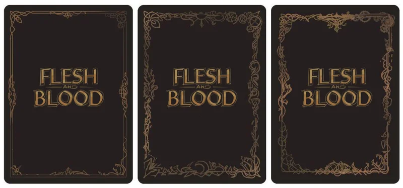
We knew from the beginning that we wanted to depict all eight regions on our card backs, in order to represent the world of Rathe. Initially, we created a thin border, comprised of all our regions tied together. We included colour to represent each of the eight regions, but this made the design feel disorganised, and we didn’t feel that it captured the feeling of the game.
Bringing the design back to a single colour helped to unify the design, and make it feel more integrated. However, it still felt as if it wasn’t properly representing the game.
We then made the decision to branch away from the thinner borders, and explored full illustrations, much like the kind that you might find on traditional playing cards. The illustrations on the backs of playing cards are incredibly complex, but come together as a whole, so that no one detail stands out more than any other. It works to tell a story, while also acting as a counterpoint to the cards themselves.

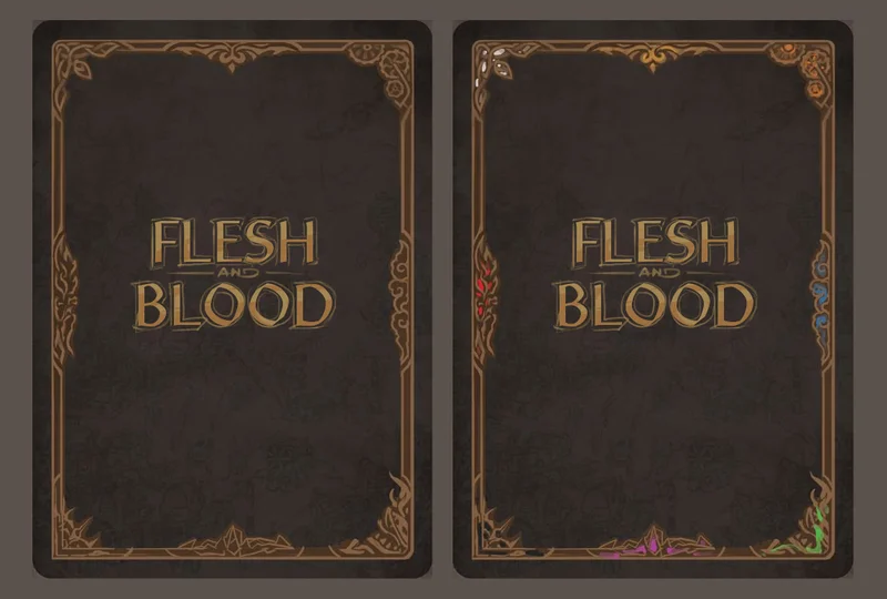
Having this level of small detail, combined with a simpler colour scheme, really emphasised the Flesh and Blood logo itself.
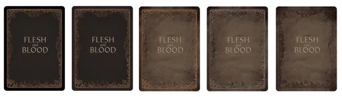
We experimented with a number of different materials for the background texture, incorporating parchment and stone. Parchment allowed us to use gold, brown and black inks to create the feeling of an old, worn tome. While this was an interesting concept, we decided not to use it, as it made the cards also feel worn and well-used, which wasn’t a great feeling for someone buying brand new cards.
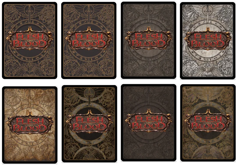
However, we’d already used a rock-like texture for the logo, and we didn’t want the logo to blend into the card back. We decided to experiment with a more fresh paper texture, rather than one which looked aged.
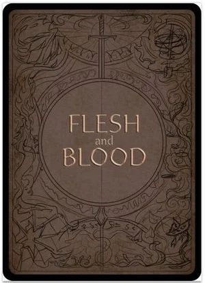
We then experimented with different styles of shading, highlighting different aspects of the card back. Ultimately, we decided not to use this concept as the shading created a 3D feeling, which was already well-established in the logo.
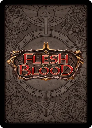
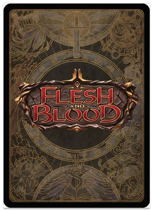
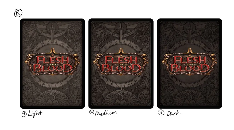
Finally, with a few colour tweaks, we arrived at our final card back design - something that represents each of Rathe's eight regions, while also representing Flesh and Blood as a whole. We hope that you're as happy with the end result as we are.